Monday, 28. July 2025
Installing *BSD in 2025 part 5 - Bonus: A look beyond our teacup
[This article has been bi-posted to Gemini and the Web]
Installers play a huge role in forming the first impression of newcomers: They are the first experience any operating system provides to people who want to get started - or the first obstacle.
This article will be the last of a series that went beyond my expectations in about every regard. The original intent was to simply review NetBSD's installer (I even found a raw first draft for an article dating back to December 2023), but I thought that I could extend that to all four major BSDs. Slightly annoyed by how some gullible people take the answers given by AI chat bots as plain truth, I decided to investigate what various open-source models claim about the BSDs. Then I did the actual installer reviews and was surprised that (mostly for NetBSD but also for OpenBSD) this sparked quite a bit of interest.
Writing those articles proved to be much more work than anticipated, but I'm happy that they helped spark a bit of discussion. There have been a couple of misunderstandings – for example, someone on HN misinterpreted my comments and thought I was arguing that adding a new keymap to FreeBSD was difficult (which I absolutely wasn't!). But writing the series has been a lot of fun, too.
So this little "bonus episode" will conclude it. And what better way to wrap things up than to take a (_much_ less in-depth) look at some other installers for non-BSD systems? I think showcasing a few positive examples, and highlighting a top 5 of the worst installer blunders I've encountered would make for a nice final part. Warning: There may be a somewhat unhealthy dose of sarcasm or cynicism especially in the second half. 😉
An illumos installer: OmniOSce's Kayak
One installer that I've always liked is the newer one (there's also a text-only installer still available) that comes with OmniOSce: Kayak. Why? Because of its minimalistic menu-driven style, I'd say. It does use dialog windows but doesn't rely on them exclusively. I also think that it has a pretty nice color scheme that's very readable and easy on the eyes. Not everybody might agree, of course, but that's what I think.
Well, and it's a remarkably lean installer that allows you to install the OS in just a few steps. So let's take a quick look.
After starting up, it immediately presents the user with a list of keyboard layouts to choose from. It pre-selects the US keyboard as the default, so a lot of people can just hit ENTER right away.
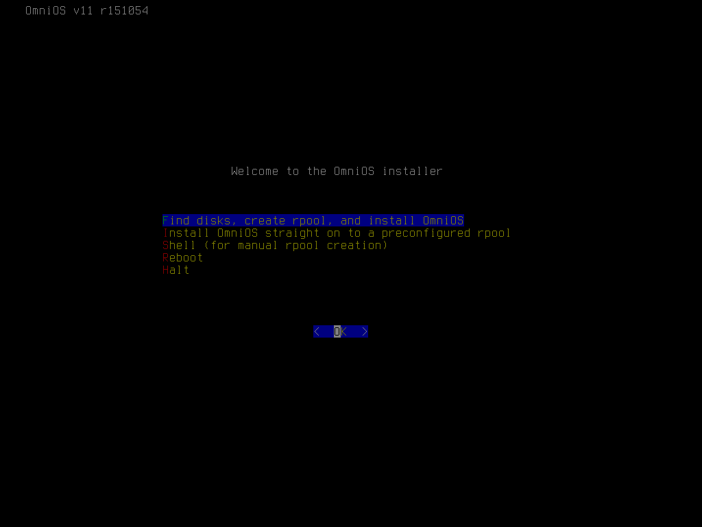
Having selected the keymap, the user is presented with the main menu, which is about as simple as it gets: five options and a single 'OK' button. Yet it has all the options that you need: Disk selection / root pool creation / installation (which most people probably use), installation to a preconfigured pool, shelling out (to manually create a pool), rebooting, halting the machine. This is perfect!
Choosing the first option brings up the disk selection window. It lists all the disks available for potentially installation and lets the user select one or more using a common checkbox mechanism.
If multiple disks are selected, the next window allows you to choose the RAID level to use. I've selected two disks, so I get the choice to build the pool from two striped VDEVs or two mirror VDEVs. If the system had more disks, additional options would have become available. If only one disk is selected, the only option is stripe, and in that case this window is simply skipped, which makes a lot of sense.
Next is zpool configuration. This is where I think the options Kayak presents are a little _too_ minimalistic. It offers only a few options: the pool name, the partitioning scheme, compression, and the option to force 4k sector size. Especially for compression, it doesn't even allow the user to select _which_ compression algorithm to use, only to enable or disable it. But that's why the installer gives the user the option to escape to a shell, run 'zpool create -O $whateveryouwant', and then use the manually created pool, right?
Then the hostname needs to be decided. This window is fairly standard, but Kayak does one thing right here: it proposes a default. While you probably don't want to use that, it makes it clear that the system expects the hostname in its short form and not as an FQDN!
For timezone selection, the installer again uses a full-screen list instead of a window. There are no bars trying to give you an idea of where in the list you are; instead, a percentage does that. Just like with the keymap selection, I think this works really well.
Since using the correct time is extremely important, a window with timezone information is displayed, asking the user to confirm the choice.
And that's really all you have to do! After these few decisions the actual installation process starts, and data is written to the pool.
OmniOSce is a small operating system (the ISO image is not even 300 MB in size for version r151054!), so the installation finishes pretty quickly. An "installation complete" window displays some information about the boot environment that was created, as well as how to proceed from here.
Acknowledging the previous window takes the user back to the main menu. The two options to install the system (guided or using a preconfigured pool) are gone, but a new one to configure the system has appeared. I think the "Welcome to the OmniOS installer" line doesn't make sense when you return to the main menu and should also be replaced by something like "OmniOS has been successfully installed". But that's a cosmetic issue.
The system configuration menu is great! Its ability to configure networking, add users, and enable SSH was incredibly helpful when I first explored the OS years ago. Solaris presents unique challenges, especially for newcomers unfamiliar with its networking, user management, and SMF (Solaris' service manager). This menu acts as a valuable safety net, making it _significantly_ easier to get started.
The menu also allows you to set the root password, enable virtual terminals or the serial console as well as the extra package repository. And in newer versions of the OS, it even allows you to use cloud-init to further provision the system! It doesn't try to do everything, but what is available makes perfect sense.
The network configuration menu provides all the expected standard options. What I find interesting is that OmniOS defaults to static addressing. Of course, it can be switched to DHCP for people who want to use that.
User creation is done in a very nice dialog window. Combining it and the next two windows into a single screen would consolidate user information and improve the workflow. But that might also mean putting too much into one window. It's hard to say without trying it out.
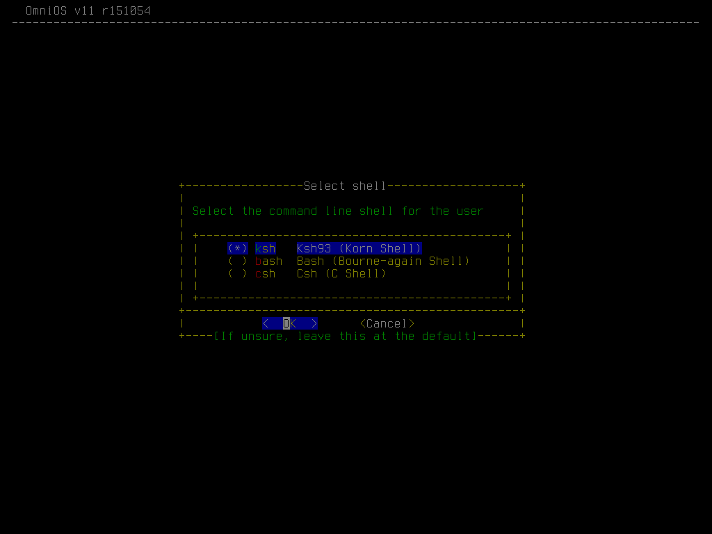
The second user creation window is for selecting the shell to use. Solaris (and thus OmniOS) offers three: ksh (a solid standard), bash, and csh.
The last window is about giving the user privileges. The 'Primary Administrator' role allows the user to utilize Solaris' native 'pfexec' for operations requiring root privileges. The option to also offer sudo is nice as people with a Linux or BSD background are more familiar with it.
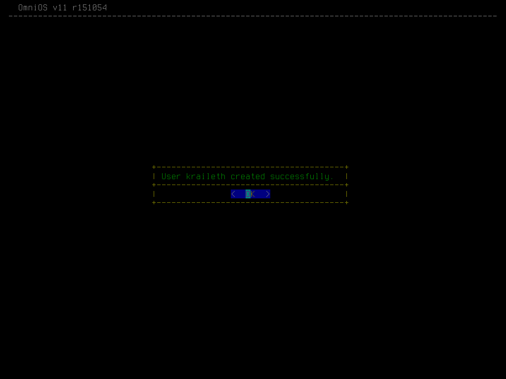
Finally, a confirmation window indicates successful user creation. And that's really it. I'm not going to discuss the remaining options here.
In my opinion, Kayak is remarkably effective at what it does. It mostly found a great balance between sane defaults, enough flexibility for common different needs, and leaving advanced options for people to do by hand. I really like how it utilizes menus and windows instead of putting everything in a window. Excellent work, Kayak team! You've created one of my favorite installers for open-source operating systems.
Some good bits from the Linux world
With a quintillion (or more?) of Linux distributions out there, there's also a huge number of installers used by such systems. Some distros, like CRUX or Gentoo, never had an installer and are always installed by hand. Others, like Arch, once had an installer (the "Arch Installation Framework", which however was discontinued ages ago). Most do have some kind of installer, though. In this section, we'll take a look at what some of them do well in my opinion.
Alpine Linux
Alpine comes with an installation script called 'setup-alpine', which allows for an OpenBSD-style installation. It differs in being more verbose and dividing the process into sections, but otherwise it's the same "just answer questions" way of installing.
First, the installer asks for the keyboard layout to use and allows you to configure the network.
In the next section, the root password, time setting and the package mirror to use are to be decided.
Lastly, the installer allows you to create a user, configure the system for remote access, and to actually install the system.
I think the installer wastes quite some space by always printing out the full set of choices for keymap or timezone. It's useful the first time you do an installation, but then you know, right? I prefer OpenBSD's less verbose approach, where a list is only printed if the user requests that. But Alpine's install script has a few things going for it, too. For example, I've always appreciated its flexibility in terms of the daemons it supports. As you can see in the third screenshot, it's possible to use OpenSSH or dropbear for SSH (or no SSH daemon at all). The same is true for NTP servers (busybox, openNTPd, chrony, none), even if that's not shown in the screenshots.
However, setup-alpine offers another interesting feature: while it doesn't handle partitioning at all (take what you get or do it by hand!), it offers different types of installation. I chose 'sys', which means the selected drive would be used for a typical OS installation that can be booted from. If the user selects 'data' instead, the drive will be used for storing persistent data only. This is meant for when you run the actual OS purely in RAM. In this scenario, you typically boot from a USB key or something, and during boot, the system would always install the required packages from the repository. I always found this mode of operation quite interesting.
Debian
Since Debian is popular both on servers and as a desktop distro, it comes with two installers. While a lot of technically versed people prefer text installers for their desktop systems, too, graphical installers can admittedly be more welcoming to newcomers. This is why Debian does the only sane thing: it provides both.
The boot menu allows the user to choose between the graphical and text installers. This is a great solution if you don't want to have different installation images for desktop and server.
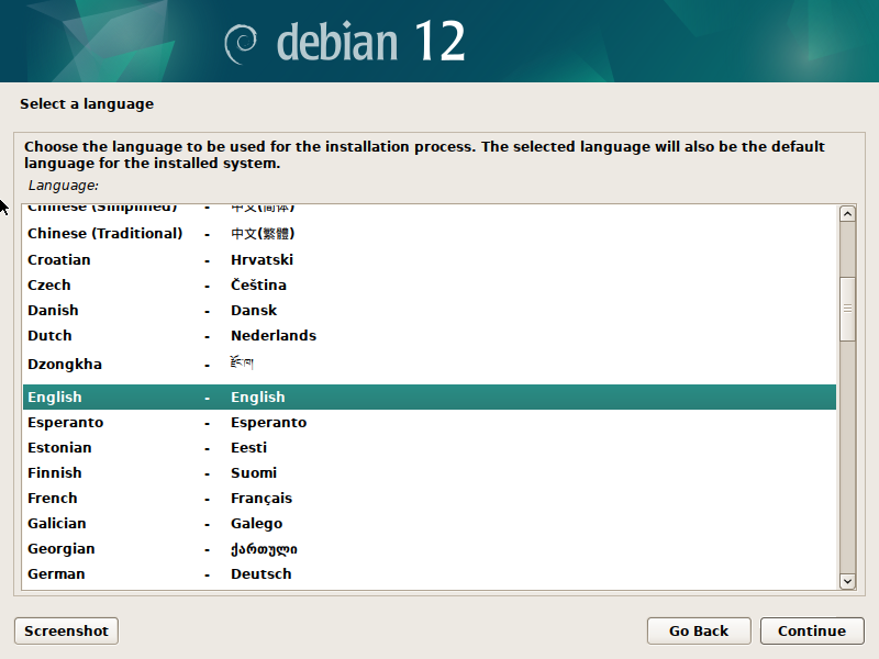
Language selection in the graphical installer provides a list to choose from.
A progress bar displays the status of the current operation.
The text installer is functionally equivalent in providing a list to select a language from. It's just simpler and you don't need a mouse.
This applies to other aspects of the installer as well. A progress bar is a progress bar and the text version just looks a little nicer (i. e. no useless "polish").
Debian's (text) installer is nothing special - but it doesn't have to be. It simply does what it's meant to do, and I always liked it for just that.
openSUSE
YaST (Yet Another Setup Tool), openSUSE's... well, _setup tool_ and I go back quite a while. Back in the mid-1990s, it helped me get any work done at all when I was completely new to Linux. Once I became more comfortable with the shell and understood the underlying principles, I preferred alternative configuration methods. And then I didn't touch anything SuSE for... about two decades? When I eventually did take a look again, I found that it had evolved - but not as much as I had expected. YaST can be a little weird, and openSUSE's persistent greeting after logging in – 'Have a lot of fun!' – reflects the sometimes quirky experience of getting things done. But in terms of OS installation, I highly respect YaST.
As a distribution that's used on both servers and desktops, it makes sense that YaST has two faces: a graphical front-end and a text one. Unlike Debian, openSUSE simply defaults to the graphical installer, requiring users to know how to launch the text version. In that regard, they could do better. But let's take a look at the actual installer. Because while Debian's graphical one is rather pointless, openSUSE's actually isn't.
SUSE makes good use of the additional space that graphics mode offers. While I cannot help but think that the left bar was maybe inspired by Windows 98's installer, that's not necessarily a bad thing. You get a great overview of where you are within the installation process, which is nice. There's even the option to change the theme / style (for example for high contrast, which I'm pretty sure the visually impaired will appreciate!).
The welcome screen exemplifies good design, combining language selection and keyboard layout in a logical and efficient manner. And using the remaining space for the license agreement is a good idea as well.
Now, the time settings screen shows that they decided to go all-in with what graphical mode allows for. The map is definitely fancy, but since the rest of the screen is plain and simple as well as laid out nicely, it actually works. I don't particularly like fancy, but being limited to one core element while not breaking the design language of the overall installer, I have to admit that it isn't half bad. Would I have done it like that? Probably not. But in my opinion, it's one of those rare cases where a bit of polish is not annoying, even though it doesn't hold much value of its own.
The installation overview is a screen that I'm a big fan of. After making his or her choices, the user can review them all (and actually make changes - the turquoise text lines are links). Not only can you make changes if you changed your mind, but you can also further customize things that the installer didn't ask about specifically.
For example, package selection is handled well. Based on the chosen machine role, YaST proposes relevant package sets. Clicking on 'Software' in the installation overview lets you select and deselect additional ones. Furthermore, users can enter advanced mode to make granular selections, including individual packages to include or exclude. Fortunately, YaST performs sanity checks on selections, alerting users when it adds dependencies to ensure compatibility. This is pretty impressive.
While the graphical front-end of YaST is pretty good, there's fortunately a text-based one as well. Because why would you want to deal with the hassle of VNC (which cannot even map keys correctly if you use xmodmap on your workstation!) to install a server?
The text version is _mostly_ equivalent to the graphical installer. A series of items to go through and a progress bar work just the same. You simply have to make do without the global overview bar at the left.
This screen works just like in the graphical version. They've done a good job at making it look and behave pretty similar.
Time settings are quite different of course. And here it shows that not having a huge map take away so much space, you can fit two lists on the screen instead of hiding them away in pull-down menus. But at the end of the day either works.
The installation overview is also basically equivalent to the graphical version. However it is complex enough that the text version is more difficult to navigate since you cannot just click on something. It's still okay, though.
The same is no longer true for this screen however. While you can still configure the system down to the package level in text mode, doing so is pretty cumbersome compared to the graphical installer. Hats off to SUSE, though, for making it work nevertheless and for obviously putting some effort into making it _relatively_ painless.
When it comes to Linux installers, openSUSE's for Leap 15.x is probably my favorite. Someone clearly thought about UI design and the result definitely shows that it's always well worth to do that! But not only that, the installer might also be the most versatile one. Within the expert partitioner (that I have not showcased here) there's a couple of things that should be done differently from a UX perspective (i. e. would save you more than a dozen clicks for more complex installations). So I won't claim that it's perfect, but I will say that if you want to see what a well-designed installer can look like, give openSUSE Leap 15.x a try. For the upcoming 16.0 the installer regressed massively IMO. I can see why they are doing that, though. SUSE's various projects like MicroOS have very different requirements than classic OS installations. But yeah... We'll see what they'll arrive at when they got some more time to work on the newest iteration of the installer.
RHEL and clones
The RHEL family of distribution comes with a couple of really nice things. One of them is related to the installer, so let's take a look.
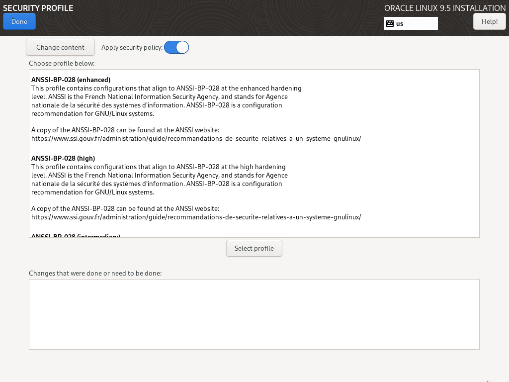
Anaconda allows for choosing a so-called _security profile_. And what's great about this is that the respective security controls are applied _at installation time_, so security is not an afterthought that someone had when configuring the fresh system. The additional security measures are active right from the first boot. This is absolutely awesome!
Here's an example of activating a profile. The rather well-known PCI-DSS (for systems dealing with credit cards) is a rather simple one: It installs (and configures) a couple of additional packages and it blocks some others (to block out applications which use unencrypted protocols).
The profile for the STIG (Security Technical Implementation Guide) of the DISTA (US Defense Information Systems Agency) goes beyond that and also adds partitioning requirements on top, which make a lot of sense if you _still_ use a filesystem that doesn't combine volume management and actual filesystems (RHEL uses SGI's old XFS by default).
And what if you have special requirements to fulfill? In that case you can simply (ok, this admittedly is an understatement!) create your own custom profile. The installer allows you to just import it! Well... Or rather it used to allow for that. In their ongoing quest for suckiness, Red Hat decided that this was "not flexible enough" and removed the feature for RHEL 10.
Yes, that's right: They cut a unique feature that allowed everybody to do hardened installs by just applying a security profile! Achieving the same result now requires creating a custom hardened image and a corresponding kickstart profile. Hats off (pun intended) to RH for this! (This led me to seriously evaluate openSUSE's AutoYaST, which I ultimately found to be more powerful and automatable.)
Void Linux
Void provides a simple installer that can help you get a basic system up and running without breaking a sweat, but it does deliberately not try to allow for everything. For example if you want to use root-on-ZFS (which is relatively well supported on Void), you have to install by hand.
The installer follows a familiar, menu-driven approach. You navigate a menu, make your choices and eventually end up with a bootable OS.
This screenshot is why I included the Void installer: When you create a user, this dialog window is how they let the user select group memberships! It's a subtle detail, but I appreciate how the installer handles group selection. Offering a list to select groups from is neat enough that I thought I'd include it here.
Top 5 Worst Offenders
Of course not all ideas people have for their installers are good. Now looking for the worst installer crimes of the broader Linux ecosystem could be a dead-serious task. But to not end this article with too negative vibes, let's make it into a contest of the most stupid or annoying ideas! So without further ado here comes rank no. five:
5th: Debian
The fifth worst offender when it comes to installer stupidities is Debian. Why?
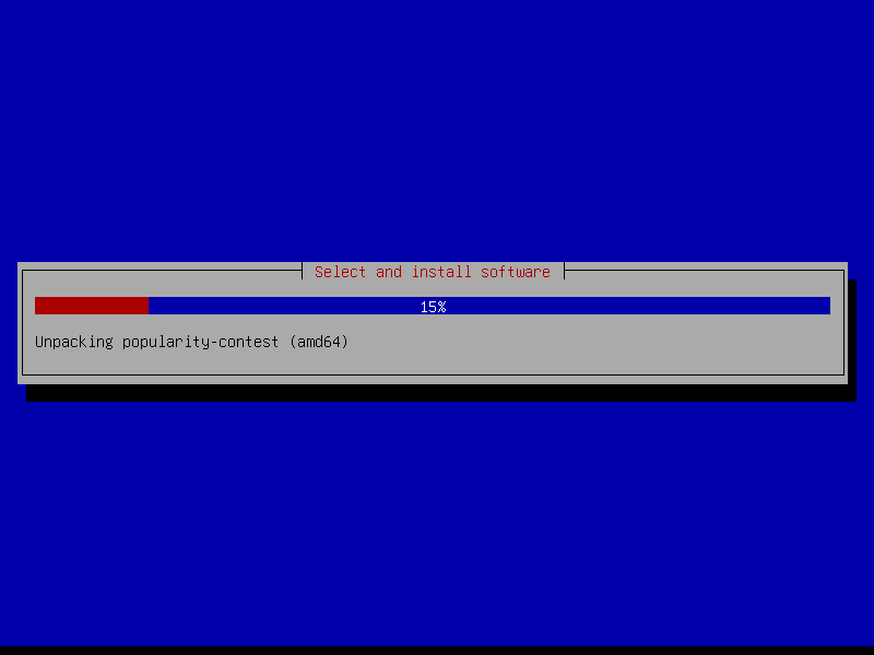
Debian runs a so called "popularity contest" which is about gathering data on which packages are most frequently installed by people. There's nothing wrong with this if it's an informed decision for the user. And indeed Debian gets this right: It's opt-in, not opt-out! This is commendable.
Of course there's one catch: This is not done at the beginning of the installation or at the end. Oh no! It happens right in the middle... So whenever you begin an interactive Debian installation, you cannot turn away and come back a while later with the installation finished. That would be too easy. Fortunately somebody came up with the brilliant idea of that stupid interactive window which pauses the installation process! So you've got to wait for the basic system to be installed and then again for a while into the installation of additional packages until finally the package contest triggers. That special kind of stupid alone justifies a solid fifth rank in _my_ little contest!
To further support it against the competition, there's an annoying regression in the Debian installer. I still remember when it would have asked whether or not to try to get network parameters via DHCP. For some reason or another, many years ago Debian started just assuming everyone wants to use DHCP and so now you have to cancel (or wait for it to fail) if you want to do simple static addressing. That means a certain type of packets get broadcasted through your network - which in turn might mean to irritate the watch program that was set up to detect when customers who have root machines try to use DHCP... Thank you so much, Debian!
4th: RHEL and clones
The installer from Red Hat is called 'Anaconda'. It's used for RHEL and its various clones (like Rocky Linux, Alma Linux, Oracle Linux, ...) as well as other RH distributions like Fedora and CentOS. I'm not terribly fond of it for several reasons. Let's take a look at some.
The welcome screen / language selection is not actually half bad: Two lists to choose from, an input field and two buttons to the lower right to quit or continue respectively. The continue button even has a nice blue color to make it stand out. If Anaconda had been able to just keep it up like that, it would have not scored 4th and thus worse than Debian, though...
And here we go: Somebody thought that it would be pretty cool and original if making the various choices for the installation was _non-linear_. But this is not a game, where non-linearity would indeed likely be a plus. This is an operating system installer! There's no actual benefit in being able to do things in whatever order you want to. The 'Begin Installation' button to the lower right is disabled until you made all the required choices.
And it gets worse. If you choose anything like 'software selection' for example, you end up in a new screen. 'Minimal Install' and 'Custom Operating System' seem to be doing exactly the same thing - at least I've not been able to figure out any difference. But that's a relatively minor complaint. Much worse is that the 'Done' button is not where you'd expect it to be. It was moved to the upper left and _into the decoration bar_! Having to click there to return to the main menu may not exactly be a tragedy but it's still very bad and quirky.
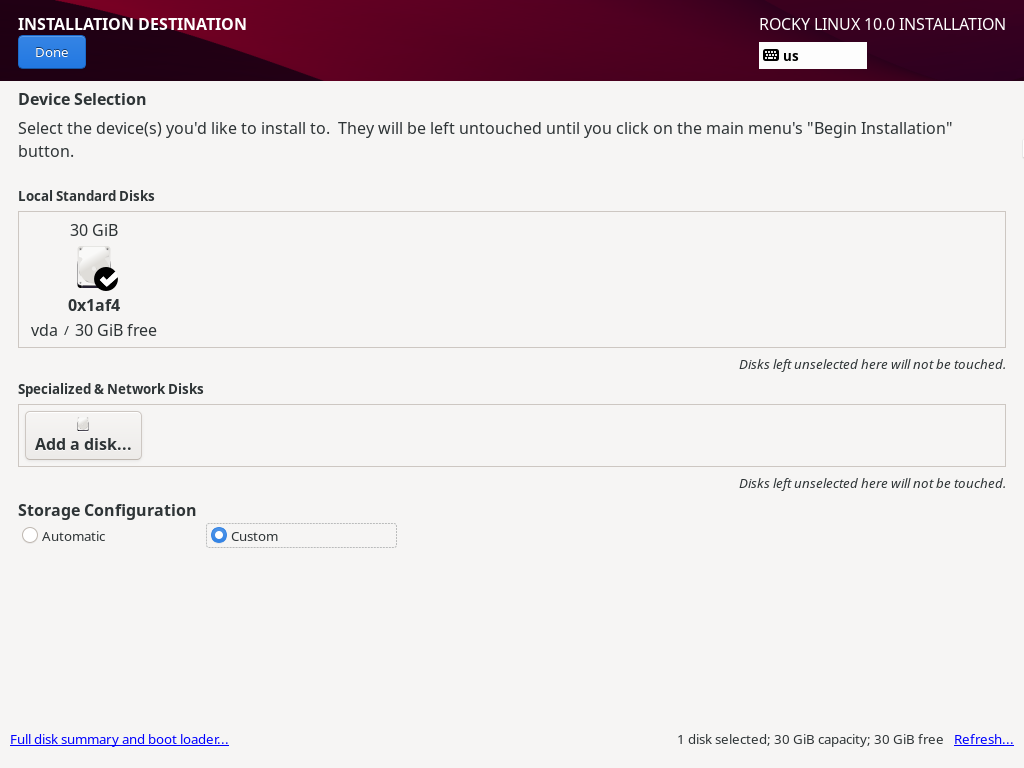
Then we get to disk partitioning. The standard 'Automatic' mode works fine, but a lot of (or most actually?) people have special requirements and prefer custom partitioning. So selecting the 'Custom' radio button... simply hides additional information that was present below. Yes, that's all! No additional options whatsoever. I still remember quite well how I thought "what the heck?" when I used Anaconda the first time.
So what's the solution? Well, you're meant to click the 'Done' button, even though you are absolutely _not_ done with the partitioning and do not want to return to the main menu. In this case it doesn't actually do that, anyway! It takes you to another screen...
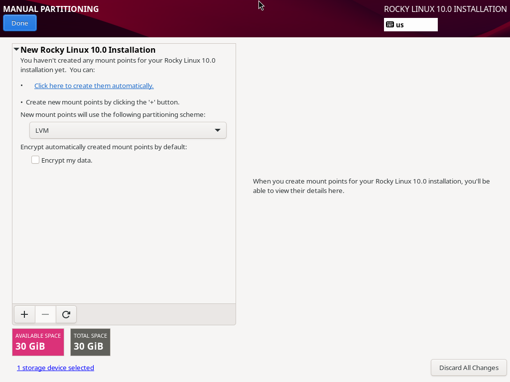
Welcome to manual partitioning. I have no idea for how many different operating systems I've done custom partitioning in my life, but it's been a couple. Anaconda's take at this relatively basic task is... special. The design approach is as counter-intuitive as the 'Done' button, which inexplicably serves to both return to the main menu and launch additional screens (but maybe that counts as a twisted form of consistency?).
Also note that the margin for the headline and the 'Done' button is off in this screen. Anaconda is not a hobbyist installer; isn't it baffling that a project backed by such a major player in the Linux world can't even get the basics of aesthetics right? As if the Anaconda 'UX' disaster wasn't enough.
After this horror show you maybe wonder why this is only rank 4 and who actually managed to screw up even worse? It's probably only due to me having reported above that RH dropped the security profiles, so I'm not going to hold that against them now. Otherwise we'd have a tie!
3rd: Ubuntu
- Sigh* Alright... Ubuntu. This distribution used the Debian installer for its server installations for years and years - which worked rather well. Then they decided to ditch it, only to replace it with something much worse. Since Canonical did this about the same time they decided to bet on ZFS, you'd bet that their new installer would offer support for it. But heck, no! To install a server with ZFS, they wanted you to grab a _desktop installer_ (!) and then perform a manual installation involving debbootstrap...
I've had a lot of... err, fun with the Ubiquity installer (and subiquity), and I failed to find at least one redeeming quality.
Ubuntu's installer is ugly as hell and navigation is super weird in some cases. And these are probably its better characteristics!
Wonder how you could escape to a shell? This option among others is hidden under 'Help'! If you've never used it, based on the previous two screenshots you probably think that I'm being overly harsh here. Just wait for the next ones.
Now the installer is getting warmed up on terrible layout! There's so much wrong with this screen that I'm not even going to describe it. And of course selecting custom doesn't make things any better.
Okay, so this is the _overview_ screen (for a relatively simple storage layout, mind you). I just wanted to make that clear in case you didn't immediately realize. Oh my... This is about as far away from clearly arranged as possible.
And when finally the actual installation begins, the ordeal is far from over. As you can see, there is _no_ progress indicator so you are left wondering when it will ever end. All you get are log-style messages to give you a clue about what's currently happening. And curtain, the installation tool from hell, is painfully sllloooowww. Oh, and not only that, it's crash happy as well. Installing on fresh drives usually works, but if you have something else on there already, chances are that it will be unable to delete the old partitions and create the new ones... Major takeaway: If you already got an OS on your machine, don't replace it with Ubuntu. Chances are it's something better, anyway.
When the installation is finally done, Ubiquity will do security updates, too. That means you've got some more time to stare at the awful mess that is Ubuntu's installer. For 24.04 they removed an option to cancel the security upgrades. Which however doesn't matter much, since it was just another evil means of punishing the weak who were tempted to use the button! If you did, curtin would spit "cancelling security updates" or something like that in your face and then take its sweet time! I honestly don't know if waiting for it to cancel or just suffering through the security upgrades made much of a difference in wasting minutes of your life.
Ubiquity is a nightmare of an OS installer. There's nothing positive I can say at this point. What were you even thinking, Canonical?
2nd: RHEL (yes, again!)
Yes, unfortunately we have to return to Anaconda once more, and yes, in a way it's even worse than Ubiquity. Let's get it over with...
By the way, if you ever wondered if you can fail even _before_ the installer, here's an example for that. Yes, this is the *final release*, not a beta or anything. But we're in Linux land, right? "Seems to work" is good enough, even for an "enterprise" distribution (this is Rocky, but it happens with Oracle as well). Why would you investigate a call trace before releasing? But that's not Anaconda's fault, it's just some additional context about how things work in penguin land.
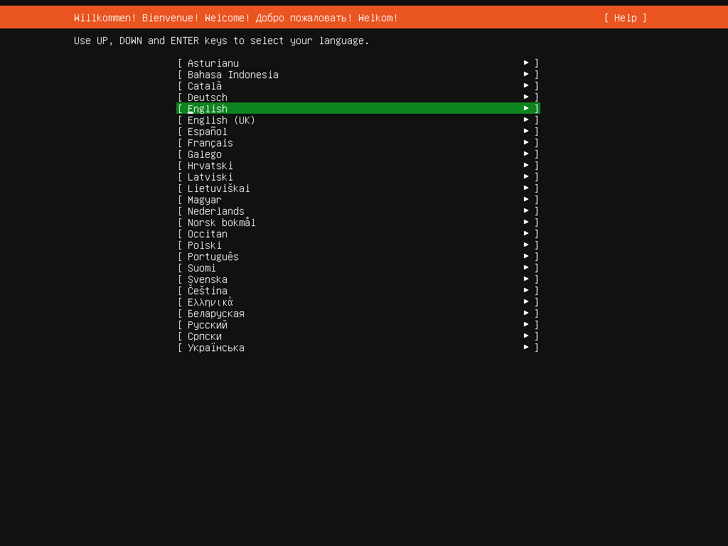
Anaconda can run both in graphical and in text mode. Making the graphical installer the default for a distribution that's mostly used for _servers_ is already a quite weird decision, but it certainly doesn't qualify for second place in this top 5. But imagine you edited the command line in the GRUB boot loader (appending 'inst.text') and loaded up the text installer - only to find it _crippled_... That certainly does. Seriously: what the heck, RH?
I mean, it's frequently the case that graphical options cannot do everything and for the full power you use the CLI. But the other way round? Remember: It's not like graphical Anaconda was the zenith of usability and text-mode Anaconda simply didn't quite reach those heights. In reality the former is sub-par in general and the latter _cannot even do that_. The fact that they also utilize tmux (a good decision) unfortunately has no chance to save the day. Congratulations, Red Hat, on a solid second place! And shame on you.
Sorry for the German in the screenshot, BTW. This was what the installer came up with for me and I've been unable to change it. Yes, there's option 2 "Spracheinstellungen" (language settings) and you can select English there. But unlike what graphical Anaconda does, this seems to only affect the keyboard layout and does not change the actual installer language. So even that very basic feature is broken.
Well, it doesn't matter much, since text-mode Anaconda is pretty much broken by design as it openly admits (not being able to do custom partitioning is a complete deal-breaker for me). Oh, and thanks for asking if I would rather do a remote graphical installation using RDP. Haha! Good one. For a Linux server... Yeah, screw you, too.
1st: SUSE
And the winner is... SUSE! Or rather openSUSE Leap 42. Yes, that particular version. This might come as a surprise since I praised YaST as an installer earlier in this article. Well, for Leap 15 it is great and I stand by that. But for some reason SUSE tried something different for the previous version 42. It's a perfect example that ignorance can have as much of an impact as actual malice. But what did they do?
Here's the language, keyboard and license agreement screen of this version of the installer. And no, while additional points for the super ugly color theme would be due (as well as for the lame attempt to transition to a new version scheme), Leap 42's installer doesn't need them to score rank 1.
Here's the installation summary screen. You don't have to remember exactly what the one for Leap 15 looked like, but probably you remember that you had to scroll because not everything fit on screen at once. Not so much this time. Somebody obviously had the idea to have as tidy an installer as possible - and boy, did they succeed at that!
Have a look again. Can you see what's missing? We have 'Booting', 'Software', 'Default systemd target', 'System' and 'Firewall and SSH'. Wait a second... Where's 'Networking'? Exactly! It's not there!
Here's what happened: YaST silently (!) attempted to configure the network via DHCP. And worse: If that succeeds, there is _no_ frickin' way to configure it differently! The installer just won't let you. Now imagine if you will the not exactly far-fetched use case of installing an OS via PXE using a dedicated install network. DHCP is a must for PXE, but of course you want to separate your networks and by not allowing to select other network settings it effectively means that the resulting installation is inaccessible by normal means afterwards...
This is absolutely brilliant. No, let's not be modest: It's a stroke of genius. And that ingenuity made SUSE's YaST of Leap 42 come out ahead even before RH's Anaconda. Heartfelt congratulations, and my deepest sympathy. Fortunately Leap 42 is quite old now and before long we'll know what new ways to screw up they came up with for Leap 16.
Honorable mention: NixOS
Of course there's definitely many more failures to be found in Linux installers. I'd like to end this with one honorable mention that tried really hard but unfortunately couldn't beat Debian's decade long stupidly placed popularity contest. And when I say really hard, I mean it. But it's a niche distro that people know because it comes with this cool purely functional package manager. But even if it screws up hard (and it does), all you do is laugh and move on. Debian on the other hand is a constant nuisance.
Ah, yes. The beauty of graphical installers gone wrong. As you can see, here's a summary that doesn't fit on the screen. There's scroll bars at the side - but you cannot scroll down more than a few pixels... Also hitting RETURN or SPACE does not trigger an (out of view) 'next' button or something. So at the screen resolution of my VNC application this proved to be a dead end before the actual installation would even start!
Sorry NixOS! Admittedly you gave it all and yes, this is pretty embarrassing. But all you get for it is this lousy honorable mention.
Conclusion
I hope that you enjoyed this wild ride through notable good ideas in installers as well as their worst atrocities. Almost all of them have both their merits and their flaws, but all installers were definitely not created equal. In the end that's probably a good thing because people will continue to try out weird new ideas. And that's why we all love Unix, right? An OS that by design doesn't stop you from doing really dumb things, because that might also keep you from doing really smart things.
What's next?
My list of topics to write about is getting so long that it's starting to worry me. I haven't decided what to write about next, yet, but I might pick a one-off topic before starting another series.