[Shelley color block top 10] 6. Boundless sceneries are new: "Four Seasons Station" (OrangeYu)
by percyshelley, 2011/10/23
Starting from this time, I will recommend some of my favorite Taiwanese color block works. The next one is my favorite work, which can even be called a classic: Orange Yu's "Enter the Four Seasons". Select the two paintings "Spring Advance" and "Autumn Advance" from it.
The so-called classic works should not only give people a pleasing feeling, but also create a trend (Audience: Have you started giving a big report...). Translated into human words, I want everyone to take pictures after watching it.
The case was amazing: I went and found out that dark silk can be painted like this! (Borrowing Qie’s previous comment)
There are many classic works in the dark silk world. In the past, flubber's "Water Drops on a Coke Can", "Pisces", and sylow's "D.N." opened the eyes of ansiers and created a series of dark silk techniques. This is the interesting thing about Dark Silk: seemingly simple characters can turn out so many amazing works.
The work introduced today is also extremely classic and groundbreaking. Misser, the top master in Taiwan, gave a very high evaluation. The excerpt is as follows:
There are only some line works by sylow and four seasons works by Qemon.
(I) can ignite the excitement of passionate creation after seeing it
Missher has always had a high self-esteem. What is the work that can make him favor him? Please see the picture below
"Spring 2009"
![[Inbound] 2009 Spring In](https://gemini.nicfab.eu/lxy/external/mozz.us%2Fdark-silk%2Fshelley-color-block-top-10%2Fassets%2Fpart06-1.png)
"2009 Autumn Advance"
![[Enter Stop] 2009 Autumn Advance](https://gemini.nicfab.eu/lxy/external/mozz.us%2Fdark-silk%2Fshelley-color-block-top-10%2Fassets%2Fpart06-2.png)
I believe that people who see these two pictures for the first time will have two feelings: first, the color block pictures can be so exquisite and delicate; second, these two pictures have a picture book style (and are similar to Korean drawings) ). But I would also like to mention the groundbreaking significance of this work. Please focus on the painting of leaves and the composition of the scenery in the first picture; and the painting of the sky in the second picture. Well, let’s talk about the sky in the second picture first.
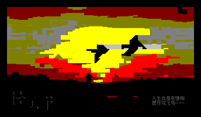
I don’t know if everyone has seen Makoto Shinkai’s cartoons. The most attractive thing among them is the gorgeous light, shadow and color transition in the sky. Makoto Shinkai likes to use bright lights and eye-catching colors such as pink and blue. However, such an effect seems to be beyond the reach of dark silk color blocks. Because the color difference of dark silk is obvious and there is no soft transition, it seems to be difficult to create a delicate color transition effect in the sky. But it is not that no one has tried it. Please take a look at the following two pictures, L4KevinX's "Long Stay", OROCHI (Taiwan)'s "Purple Clouds", and juor2 (Taiwan)'s "Kenting Sunrise".
"Long Stay Together"
"Purple Clouds"
"Kenting Sunrise"
The attempts in the above three pictures are all quite ambitious. The delicate clouds in the sky and the complex sunlight and shadows are difficult to express using color blocks. The first picture attempts to use large-area color blocks and silhouette effects to express the sunset; the second image attempts to use purple, pink and other colorful colors to express the sunset; the third image even uses the color contrast of yellow and blue to express the sunset. Describe the scene of sunrise.
All three images provide some ideas for painting the sky. For example, the transition of different color levels in the second piece "Purple Clouds", the use of lines in the third piece "Kenting Sunrise", etc. But the shortcomings of the three works are also obvious. The first two pictures used too many highlight colors and were not delicate enough, and the first picture had obvious transfer marks. In the third picture, too much dark gray is used, the distinction is not obvious, and it looks a bit messy.
OrangeYu's "Autumn Advance" is a different idea, that is, the delicate horizontal transition of color blocks, similar to
▂▃
▇▆▆▅
Coupled with the principle of emphasizing meaning rather than form. It’s very mysterious, that’s because I don’t know much about it myself =, =|||
There is a tribute work "The Last Day of 2009" in Haoyuan Hall. We can compare it.
Combined with what I said before, the reason why OrangeYu's "Autumn Advance" gives people the feeling of "it turns out that clouds can be painted like this" is because in addition to the small white clouds dotted in the picture, there is a large area of black-blue transition. , giving people a refreshing feeling of autumn. The entire black area is triangular in shape, which seems to have nothing to do with clouds, but it successfully creates the meaning of clouds. It is much better than L4KevinX, juor2 and others who deliberately depict the shape of clouds. Haoyuan's "The Last Day of 2009" focuses on imitating Orange Yu's depiction of the jagged edges of clouds, but the latter has a more seamless feel due to the proper processing of the black areas.
In addition, when it comes to emphasizing the meaning rather than the form, I can’t help but say that this really requires talent. Because the dark silk painting is unable to depict the delicate changes of the landscape, it is certainly better to focus on depicting the meaning of the object than to blindly depict the form. But how to understand and express the meaning requires the inspiration of the painter.
Here again, I would like to mention a masterpiece "Platanium Leaves" by Mr. Ou soulfox. Alas, I originally wanted to recommend it separately. When Xiao O was explaining his picture, he gave the following explanation that made us extremely disappointed:
What about stone steps, roads, trees, etc., just trace them casually.
Those leaves are also faster, they are placed randomly, that is, randomly. .
Tell me, what can we novices say? ! A master is a master! Please look at the picture below with great sadness:
Please focus on the leaves (audience: No need to remind you at all...). It can be said that any part taken out separately will not be similar to the shape of the leaf. Shouldn't the leaf look like the following? (by Bluecancer@RYGH)
But I have to admit that the leaves of soulfox look more real and delicate. This is a master who pays more attention to meaning than form!
Let’s talk about the second point, about the picture book feel of OrangeYu’s works. (Everyone looked at their watches: Why is it only the second point?) Don’t worry, there are only two points in total. . . Please take a look at her other work "Spring"
![[Pit stop] Spring](https://gemini.nicfab.eu/lxy/external/mozz.us%2Fdark-silk%2Fshelley-color-block-top-10%2Fassets%2Fpart06-9.gif)
The feeling of this picture book comes from the composition with plants as the main line/border, the twisted and changing houses, and the embellishment of some cute objects. Because the items in this type of picture book color block diagram are simple, mostly 3-4 items combined together (plants, flowers, houses, etc.), it reflects the skill of composition. OrangeYu's "Spring Advance" uses plants as a close-up view, combined with the houses and fences in the distant view, giving it a very layered look. In her "Spring", the distortion of plants and houses adds to the agility of the picture.
An equally successful work is haoyuan's "Weiming 10th Anniversary". Please enjoy the picture below. This review is long enough, so let's end it here.