Comment by 👻 ps
@freezr, thought I wanted to make the green lines symmetrical, as they are currently not. But for now, I actually like it; life is asymmetrical as well.
Nov 11 · 6 weeks ago
1 Later Comment
I meant… What are you trying to represent with this logo?
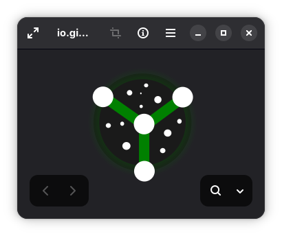
Original Post
The initial logo for the Yoda browser — I'm not a UI/art designer, but I definitely want a logo for the Yoda browser application, especially since we're planning to release it on Flatpak soon. After a few attempts to generate something with AI, I gave up and drew it manually using Inkscape (even though it was my first experience with vector graphics). Conceptually, it took me a few years to come up with the idea and only a short time to draw it. The logo looks asymmetric because I’m not sure...